The Elections Performance Index (EPI) website has just been relaunched, with a new look and updated data from 2018. The EPI was developed a decade ago with the long view in mind. But with the 2020 election right upon us, what can performance data from past elections tell us about what to expect this November?
Although the EPI is constructed using 17 indicators, circumstances surrounding the 2020 election suggest we focus on four topics the index can help to illuminate: turnout, mail balloting, wait times, and the use of the Internet to communicate with voters. The four primary points are these:
- The historically high turnout rate in 2018 is likely to continue to 2020.
- Wait times threaten to balloon in 2020, on account of historic turnout and challenges in maintaining in-person voting sites.
- Low absentee ballot rejection rates in the past mask the degree to which they are likely to spike in 2020.
- Election officials are increasingly relying on the Internet to communicate with voters, which will be even more critical in 2020.
Turnout
The main topic these days in election administration is how to foster healthy elections by increasing vote-by-mail and maintaining enough polling places to serve everyone safety who turns out in person. But that’s not the topic I want to start with. I start, instead, with turnout.
Turnout is the place to start because the principal challenge ahead for election administrators is handling demand for voting in a healthy fashion. If turnout is up, then these challenges are even greater.
Americans are eager to vote in 2020. Back in the spring, the Gallup Poll reported that Americans were more enthusiastic about voting for president than they had been since at least 2000, with the possible exception of the 2008 election. Americans also reported giving more thought to the upcoming election than at any time since at least 2000, again with the possible exception of 2008.
This enthusiasm was in evidence during the presidential primary season, in which Democratic turnout was on a par with 2016, despite the fact that the nomination was all-but-settled in mid-March. The lack of any contest at all on the Republican side kept turnout down in those primaries, but Gallup and other pollsters have been finding that Republicans are at least as eager to come to the polls to support Trump as Democrats are to come and support Biden.
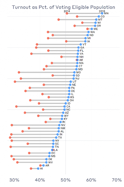
All of this builds from 2018, where data on the EPI website show that turnout in 2018 was head-and-shoulders above where it was in 2014, the previous midterm election. (The EPI draws its turnout data from Michael McDonald’s website, The United States Elections Project.) Turnout was greater than it was in 2014 in 49 states plus D.C. Of course, state-by-state variation was driven by local factors, especially whether there was a hotly contested statewide race on the ticket. Nonetheless, as the data show, turnout in 2018 was the highest it’s been (as a percent of voting-eligible population) in a century.
What does this portend for 2020? Most obviously, taking the 2018 election together with polls showing great enthusiasm to vote suggests that turnout—or at least demand for voting—will be up in 2020 compared to 2016.
It is not a big stretch to suggest that 2020 could see historically high turnout levels, at least as historic as 2018 was for midterm elections. Turnout in 2016 was 60.1 percent of VEP. If it were to rise another six points in 2020 (remember, 2018 was 13 points above 2014), we would have to go back to 1900 to see turnout so high.
Waiting Times
Long lines were the headline topic of 2012, leading to the appointment of the Presidential Commission on Election Administration and a four-year effort to address the factors that led to long wait times in the first place. That effort paid off. Not only did reported wait times decline nationwide in 2016, but they declined dramatically in the states that had experienced the longest wait times in 2012, such as Florida, South Carolina, Virginia, and Georgia.
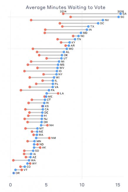
Lines—whether they be in grocery stores, call centers, or polling places—are fundamentally caused by one of three things: high service times, high arrival rates, and a small number of service stations (poll books, voting, booths, etc.). The down side to the surge in turnout in 2018 is that arrival rates at polling places went up. Without compensating increases in poll workers or speeding up check-in processes, this had to lead to longer wait times—and it did. A lot.
Reported wait times to vote increased in 43 states and D.C. compared to 2014, declining in only 7. As I wrote in a report released earlier this year by the Bipartisan Policy Center, in most cases, the explosion in wait times can be directly tied to the increase in turnout. However, a few states with the biggest turnout surges actually had small wait-time increases, such as New Jersey and Virginia. And five states—Georgia, Maryland, Montana, Nevada, and South Carolina—plus D.C. had significant increases that could not be attributed to turnout increases alone.
The implications for 2018 are obvious. If the country were not in a big race to move voters into mail ballots, we could virtually guarantee a surge in wait times in 2020, as the number of voters grew, presumably without a proportional increase in the number of polling places or check-in stations. Of course, the COVID-19 crisis is causing voters to consider their options, and causing many to consider voting by mail in November. One recent survey suggests that most voters are currently planning on voting by mail in the fall in all but a handful of states.
Nonetheless, even if the number of voters who use in-person voting in 2020 is half what it was in 2016, it’s not obvious that the wait times for in-person voters will necessarily decline. The major reason is that election officials are currently struggling to maintain the polling places and poll workers they normally count on. Thus, the physical capacity to meet demand for in-person voting will certainly be down. In addition, with social distancing, fewer voters will be allowed in polling places, and it will just take longer to process each one for voting.
Absentee voting
The election issue of the year is mail balloting. The expansion of mail balloting has been advocated as one of the most important strategies for ensuring that Americans can vote safely amid the pandemic. Mail balloting has its risks, of course. President Trump’s criticisms of vote-by-mail reflect the attitude of many that the mode is more prone to fraud than in-person voting. I have written about the risks that individual voters take on when they vote by mail, ranging from the possibility that a mail ballot will be rejected, to the possibility that the voter will make a mistake on the ballot that won’t get caught.
The EPI has four indicators that directly gauge voting by mail, two related to domestic mail ballots and two related to military and overseas civilian (UOCVA) absentee ballots. I focus here on the domestic.
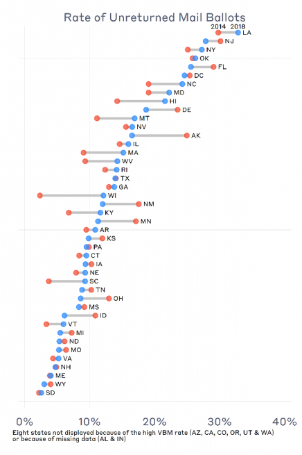
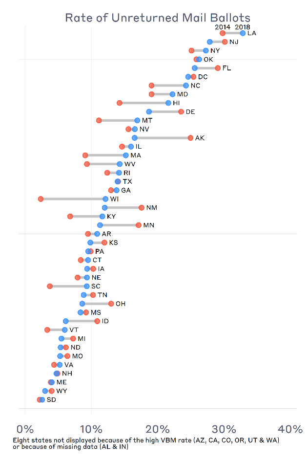
The indicators that focus on domestic absentee ballots measure different aspects of the process, and different possible mail balloting challenges. The first is the rate of unreturned mail ballots, measured simply as the difference between the number of ballots mailed out by election officials and the number they receive back from voters. (Because this statistic is primarily driven by voter abstention in vote-by-mail states and states with permanent absentee lists, not by election administration related factors, this measure is not calculated for Arizona, California, Colorado, Oregon, Utah, and Washington in 2018.)
There was considerable variation across the states in 2018, in terms of how many ballots were unreturned, ranging from 2.6% in South Dakota to 33% in Louisiana. Understanding why mail ballots are not returned is an important question for election administration policy, and one that has already been front-and-center as states have voted in the primaries.
Because values of this indicator are calculated only for states where voters must request a mail ballot, the question has to be asked, why were so many ballots not returned after voters had requested them? Did voters change their minds? Did they request them too late to return them? How many of these unreturned ballots represent fraudulent requests? Did they get lost in the mail?
We do know this: With the number of mail-ballot applications likely to double or triple in 2020, the number of unreturned ballots will double or triple, as well. The decision by states such as Vermont and Nevada to mail ballots to all registered voters will be part of the reason—many of these voters will want to vote in person, and yet others will not vote at all. The other reason is that many people will request a ballot too late for it to arrive in time. This will have the dual effect of pushing up the number of unreturned ballots and the number of provisional ballots, as large numbers of people appear at polling places with a notation on the poll book that they have an outstanding absentee ballot.
The second indicator is the mail-ballot rejection rate. This indicator is constructed in a very particular way that until recently has not gained much notice. The indicator is constructed by dividing the number of rejected mail ballots by the total number of ballots cast in an election, whether they were cast by mail or not. The idea here was to measure the percentage of ballots that are subject to litigation should an election count be disputed or go into recount. A state could have a low rejection-rate score for one of two reasons: (1) having a small number of rejected ballots or (2) having a relatively small number of mail ballots.
What this indicator has hidden from view is that quite a few states traditionally rejected a high percentage of the mail ballots it received back for counting. However, because the states had few mail ballots, they did not have an especially bad score on this indicator.
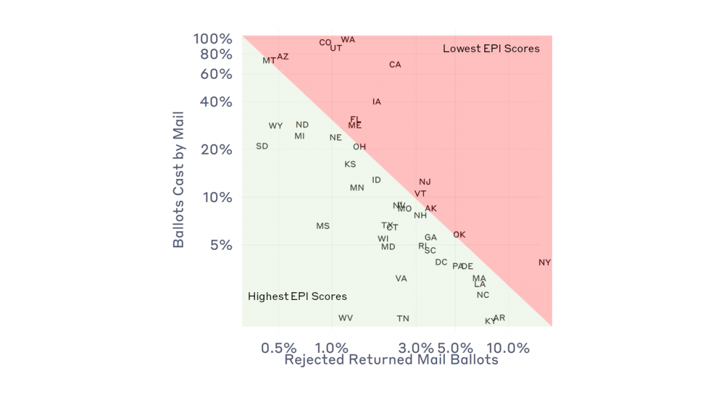
New York is a good example. In 2018, New York rejected 34,095 of the 249,002 absentee ballots it received, or 13.7%. However, only 3.9% of New York ballots were cast by mail, which means the percentage of rejected mail ballots, measured against all ballots in the state, was quite small—half of one percent.
The general issue is illustrated in the accompanying graph. States are plotted according to how many ballots were cast by mail (y-axis) and how many mail ballots that were returned were rejected (x-axis). The EPI’s rejected-ballot indicator rewards states with a small number of mail ballots and a low rate of rejection among those returned. That’s the green area of the graph. It punishes the opposite states, those in the red region.
Return now to New York. Despite having the highest rejection rate of returned mail ballots, its rejection-rate indicator score in the EPI wasn’t the worst of the lot, because of how few mail ballots were cast in the election. But, imagine if New York had had ten times more mail ballots in 2018—similar to what happened in the recent primary—and had the same rejection rate of returned ballots. It would have rejected over 5 percent of all ballots in the election, a stunning number, and something like we’ve never seen before. In terms of the graph, New York would be located in the upper right-hand corner of the figure. And, indeed, most of the states relatively close to New York—Delaware, Pennsylvania, Massachusetts, Louisiana, and North Carolina, for instance—risk joining the Empire State following 2020.
Therefore, there is a second thing we can say about mail ballots in 2020, using the 2018 EPI as our guide. Many states have been regularly rejecting a large fraction of their received mail ballots, but no one has really noticed, because these ballots did not make up a noticeable fraction of ballots statewide. This year’s election will be different. As a consequence, the states that risk being subjected to the glare of the public spotlight will be those, like New York in the primary, that witness a surge in mail ballots while rejecting a large number of them.
Communicating via the Internet
Finally there is the matter of communicating with voters. When the EPI was inaugurated a decade ago, election officials were transitioning in how they communicated with voters. The Internet has given officials new opportunities to communicate with voters, and conversely, given voters an opportunity to receive accurate, updated information directly from election officials.
When the EPI was launched in 2010, one of the biggest areas for improvement was the use of the Internet to communicate with voters. In that year, the EPI began tracking whether state election offices had one of five lookup tools on their websites:
- Voter registration status
- Polling place location
- Mail ballot status
- Provisional ballot status
- Candidates on the ballot
Undoubtedly, the biggest improvement in election performance over this decade has been the explosion of information available to voters via the Internet. For the 2010 election, which is the first midterm election covered by the EPI, only 10 states had all of these tools available for voters. In 2014, that number had risen to 14. In 2018, it is 18. Furthermore, 37 states had at least four of them. Clearly, the Internet has become the preferred way for most state election offices to deliver information to their voters, as voters themselves have become increasingly tied to the web.
Communication via the Internet will be even more critical in 2020. Two pieces of information will be especially important. The first will be to communicate about the location of in-person polling places, especially as the locations change at the last minute due to the challenges of recruiting poll workers. In 2018, every state had a polling place locator on their website. This bodes well for 2020.
The second piece of information will be absentee ballot status. We are increasingly hearing of the challenges that will face voters as they attempt to request, mark, and return their mail ballots. In 2018, only 39 states and D.C. had an absentee status feature on their website. It is too early to tell how many of the remaining 11states will add such a feature in 2020. But, with the number of mail ballots growing by 10-fold in many states, having access to this information will be critical to more voters. States without such a tool risk being inundated with phone calls from anxious voters, asking whether their ballot had been received on time.
The EPI has never recorded whether states allow voters to request a mail ballot online, but this is something we will be tracking for 2020. Allowing voters to complete their mail or absentee ballot request forms online will go a long way to reducing delays in receiving ballots, as it will also help decrease the number of ballots that go undelivered because of data-entry errors associated with transcribing paper forms.
Conclusion
The Elections Performance Index was inaugurated nearly a decade ago with the goal of illuminating the election administration issues in an objective and nonpartisan way. The EPI summarizes all 17 indicator measures with a single “EPI score.” Every state will have an improved EPI score in 2018 than it had in 2010. Most will have improved from 2014. This represents a truth that is often buried in the heat of campaigns: election administration is improving in the United States. However, this improvement is not inevitable.
How states respond to the pandemic challenge will be picked up next year, when the EPI is updated to reflect the 2020 election. An increased use of the Internet, increased turnout, and an expansion of post-election auditing (a topic I haven’t touched on in this post) bode well for this election. A likely spike in wait times and mail-ballot rejections does not. Whichever is the case, the EPI will be back to provide further frame our understanding of how the 2020 election was administered.
