U.S. Election Management is Improving
The Elections Performance Index re-launches with 2016 data today — and the news is good
After long months of preparation, the wait is over. The MIT Election Data & Science Lab is very happy to be releasing the updated Elections Performance Index (EPI), with data from the 2016 U.S. election.
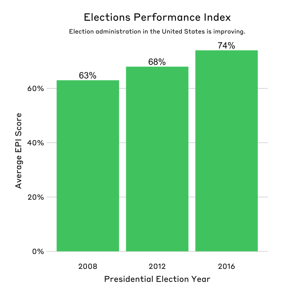
Overall, the 2016 index shows that states’ administration of elections improved by 6 percentage points between 2012 and 2016.
The EPI provides a non-partisan, objective measure of how well each state is faring in managing national elections. Using indicators that span the breadth of election administration, the index can show the impact of policy changes as well as where a state might be doing well or facing challenges. It’s an important resource for election officials, voters, and policymakers, allowing them to compare their state with its own past performance or the performance of other states.
In 2016, almost all states improved their index scores, compared with the 2012 presidential election. More good news in the index included:
- Twenty-two states improved at a rate greater than the national average
- Vermont showed the most significant improvement, landing at the top of the index for the first time
- The District of Columbia, West Virginia, and South Carolina also saw significant gains in their scores and rankings
Only six states saw their scores decline from 2012, largely due to an increase in the residual vote rate, which is a common measure of voting machine performance. However, the residual vote rate can also increase when more voters abstain from voting for any presidential candidate; this appears to have been a significant factor in the decline of four of these states.
What is the EPI, anyway? What does it do?
The EPI was initially developed an managed by The Pew Charitable Trusts, before it was bequeathed to MEDSL in 2017. When it launched in 2013, it provided the first comprehensive assessment of election administration in all 50 states and Washington, D.C.
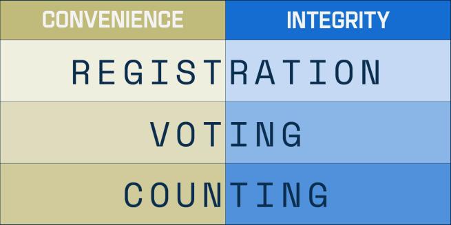
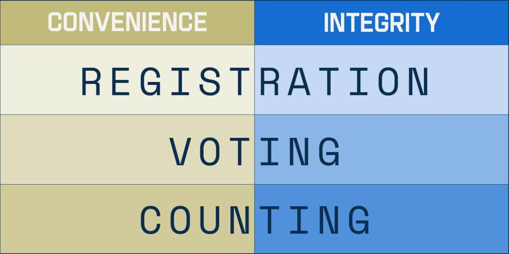
The indicators that ended up in the final EPI (which were winnowed down from a starting list of 40) were selected because they depend on reliable, consistent, and valid data that cover a range of issues involved in each stage of managing an election:

Well-run elections are both convenient and have integrity throughout each phase of election administration.

Well-run elections are both convenient and have integrity throughout each phase of election administration.
The index now includes data from every federal U.S. election from 2008 onward; it’s an interactive way to see how election management has changed over time, and to explore the context and data behind each measurement.
What was the story of election administration in 2016?
Cybersecurity might be the first issue to pop into your head when thinking about election management in the 2016 elections, but the hot topic of the time was actually the problem of long lines at the polls.
The 2012 national election made headlines for excruciatingly long voting lines. In response, then-President Obama established a bipartisan commission to study a wide variety of election administration issues, with voting wait times at the top of the list.
The effort that state and local officials put into addressing wait times at polling places paid off. Take a look at the indicator in 2016, and some of the changes are dramatic. Florida, for example, had an average 45 minute wait time to vote in 2012. In 2016? That average wait to vote dropped to a mere 5.5 minutes. Likewise, D.C. — which had 2012’s second-longest average wait — saw wait times plummet from 33.9 to 16.3 minutes in 2016.
Overall, seven states had average wait times of more than 20 minutes in 2012. In 2016, that number dropped to zero.
Full disclosure: MIT, along with the Bipartisan Policy Center, has been working on a major program to work with election officials to record line lengths and reduce wait times. If you’re interested in learning more about this effort, take a look at the report that was released in April.
What else?
A few other 2016 trends stand out to seasoned election watchers. The residual vote rate, as we mentioned above, spiked up. Designed to measure the performance of voting machine, this indicator calculates the number of under- and over-votes cast in an election (as a percentage of voter turnout), using the top office on the ballot.
(An “under-vote” means no vote was recorded on a ballot; an “over-vote” means a ballot had votes for more than one candidate in a single-winner race.)
The residual vote rate is only calculated every four years, using the presidential vote, because the top office for midterm elections varies considerably from state to state. The 2000 election (surprise!) still holds the record for highest residual vote rate in the last two decades: the national average in that election was 1.9 percent, with state highs of up to 3.9 percent. The average rate has dropped since then; in 2012, the residual vote rate was only 0.99 percent.
In 2016, the nationwide rate jumped back up to 1.39 percent. Why? Probably because there was an increase in voters abstaining in the contentious presidential race, rather than a decline in the performance on voting machines. One interesting footnote to that finding is that Nevada, which offers an option on its ballots for voters to choose “none of these candidates,” saw a historical low in the residual vote rate.
What’s in store for the EPI in 2018 and beyond?
As we look ahead to the impending U.S. midterm elections, we’re already planning out our approach for the 2018 EPI. It’s been almost a decade since the first EPI advisory committee was convened; we’ll reconvene many of them again, plus a few new faces, to boot. We’ll be revisiting the current indicators, discussing which ones might need to be altered or retired; and evaluating new potential measurements to add.
What might those new indicators be? Is there a way, for example, for the EPI to reflect some of the current concerns around cybersecurity? Despite being a hot topic, it’s proved difficult to include in the EPI because there isn’t a high-quality measure for it yet.
It’s not easy to get a direct measure the security of a state’s election system, though a major attack on a state computer system would show up in a few different ways, even in the current EPI. Voter turnout might be lower than expected, for example, or there might be more provisional ballots. More voters might complain of registration problems; longer lines might form at the polls. Still, there is room to explore in developing a measure that looks more closely at cybersecurity itself, and we’re looking forward to engaging in that exploration.
At the end of the day, the EPI is a tool to help ground the discussions happening around the complex web of systems we call election administration. These election processes and mechanisms are always changing; elections — like any other system — can be improved. The data and objective measurement the EPI provides helps us do that with an approach based on evidence, improving the U.S. election system for all voters.
We could spend days talking through the interesting bits and pieces that make up the EPI as a whole and the 2016 data in particular — so we will!
We’ll be running a series of blog posts over the next few weeks on different indicators and the things we think are interesting about the 2016 index update. Stay tuned, and in the meantime, take a look at the full EPI website!


