A Closer Look at Registration & Voting Issues
A sneak peek at what’s to come in the 2018 Election Performance Index
The Elections Performance Index (EPI) was inspired by The Democracy Index, written by Heather Gerken. In that book, Gerken wrote that
[we] deserve a system that makes it easy for voters to register and cast a ballot. We deserve a system that counts votes accurately.
How can we tell if it is, in fact, easy for voters to register in a state? One way is, very simply, to ask. That’s precisely the idea behind the EPI indicator examining registration or absentee ballot problems. As the name implies, the indicator measures the percentage of non-voters in a state who did not cast a ballot because they encountered voter registration problems, or because they failed to get an absentee ballot.
So, how did voters fare in the 2018 midterm?
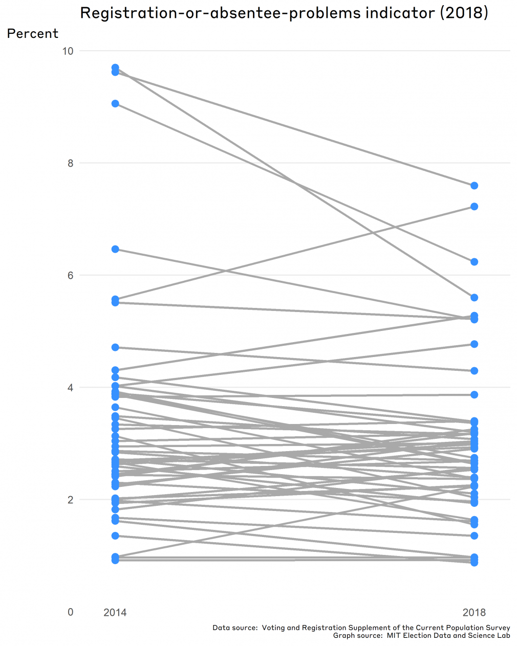
When we updated this indicator to include data from the 2018 election, the average state value is 3.0% — that’s down a bit from the previous midterm in 2014, which clocked in at 3.4% of non-voters failing to vote for this specific reason. Although the decline in the average indicator value suggests improvement nationwide, the difference is substantively small and statistically insignificant at the 95% confidence level.
Furthermore, when we drill down to individual states, (which is, after all, the perspective taken by the EPI,) state averages were very close to what they were in 2014. Indeed, there are no states in which the differences in indicator values between the past two midterm elections were statistically significant.
As we will see in the rest of this post, the values of the “registration-or-absentee-problems” indicator are largely determined by major, long-term, slowly changing policy choices made by states. Whether a state has particular policies — most importantly, Election-Day registration (EDR) or liberalized mail balloting — determines where states stand on this indicator.
Explanation of the indicator and data behind it
The data principles underlying the EPI give priority to direct measures of the indicators, preferably sourced from administrative records. Unfortunately, there’s no direct administrative measure of how easy it is for voters to register, so we have to look elsewhere for the information we need. Absent the administrative data, the next place to look is public opinion data.
Where to get this data? A natural source for information about the voting experience is the Voting and Registration Supplement (VRS) of the U.S. Census Bureau’s Current Population Survey (CPS). The CPS is a large monthly survey — over 160,000 households — that is mainly used to report information about the economy. In the November of a federal election year, however, the VRS is added to the larger survey; the supplement asks a small number of questions about voting.
The VRS is intended to provide a basic level of information about voters and nonvoters. It asks whether respondents voted or are registered to vote, and if not, why not. Because it has a large sample size, we can glean detailed information about states from the data (in most cases, at least).
Along with the EAC’s Election Administration and Voting Survey and the election results reported by states and localities, the VRS is one of the three pillars of election science research.
A brief sidenote: Because the VRS is a survey, there are a few important things we keep in mind when working with the data.
- One is the tendency of survey respondents to give socially desirable responses, which can affect the survey’s accuracy. Voting is a socially desirable act, so it’s not surprising that respondents to the VRS report voting at higher rates compared to what we know from official statistics.
- The VRS is one small piece of a much longer survey that asks many questions on employment and demographics. Research shows that respondents tend to be less willing to answer questions about voting and registration than about their economic situations.
Even so, these issues are common to survey research, which has in turn developed methods and techniques to overcome problems like social desirability bias.
And now, back to the indicator:
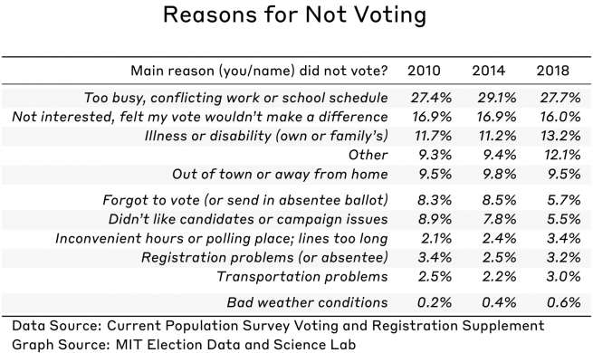
Non-voters who respond to the VRS can give 11 different reasons as to why they did not vote. As shown in the table here, the most common responses are related to political or personal circumstances, including being too busy, simply uninterested, or because of a disability. Issues related to election administration fall far down the list. Indeed, in 2018, only 3.2% of nonvoters blamed “registration problems,” compared to the 27.7% who said they were too busy to get to the polls.
Although one can wonder whether someone saying they failed to vote because of a registration problem really failed to vote for that reason, there is actually a feature of this measure that suggests it is reliable: it is highly stable across elections of the same type (midterms or presidential). (You can find more discussion of this issue in the EPI methodology document.)
In other words, if a relatively large percentage of a state’s non-voters gave this excuse in 2014, there is a good chance that a large percentage also gave this excuse in 2010 and will give it again in 2018.
This type of stability is strong evidence that when respondents give this response, it is truly related to a distinct feature of a state’s election administration environment, and not just a matter of respondents randomly choosing answers to give to researchers. When we observe a big change in the indicator’s value from one election to the next, it signals that we should dig further to understand the policy change that led to that change.
Which states perform at the high and low ranges of this indicator?
Most states saw little change in the registration-or-absentee-problems indicator value in 2018. In fact, most have seen little change since the EPI was first reported for the 2010 election. This pattern is strong evidence that whatever gives rise to high or low values of this indicator is likely related to persistent features of the electoral landscape, and not to short-term fluctuations.
When we investigate what separates states with high and low values of the indicator, two policy choices stand out: Election-Day registration (EDR) and voting by mail.
Let’s start with a look at EDR. According to the National Conference of State Legislatures (NCSL), 15 states had some form of EDR in 2018. An additional three states will implement EDR in 2020 — Michigan, Nevada, and Washington.
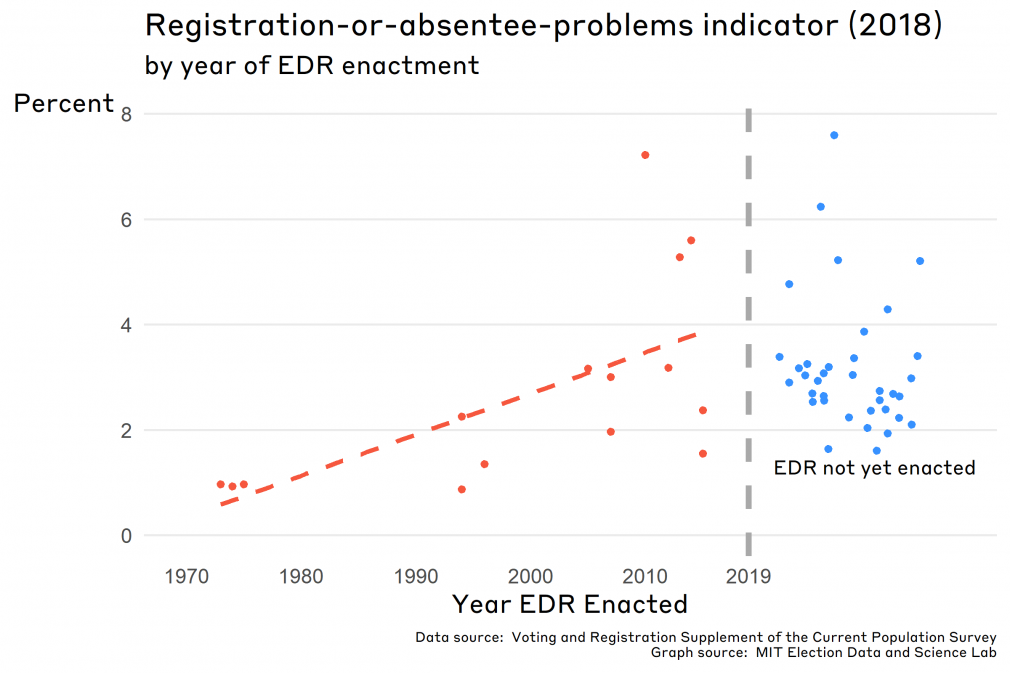
If we plot the 2018 value of the registration-or-absentee problem indicator against the year a state adopted EDR, a clear pattern emerges: the earlier the adoption, the lower the value of the indicator. (In this case, low values are good.) Three states that enacted EDR in the 1970s (ME, MN, and WI) had an average indicator value of 0.95%. On the other hand, the average for the six states that have adopted and implemented EDR in the current decade (DC, CT, CO, HI, IL, and VT) — 3.6% — is actually greater than the average for states that have yet to adopt EDR at all (3.2%).
Why the difference? This pattern is consistent with research by Leighley and Nagler revealing that early-adoption states with existing high turnout saw more impressive effects from EDR than states adopting them in later “waves.” The earliest states to adopt EDR were already committed to encouraging civic participation by a variety of methods. States in the later waves of adoption may have been less committed than “first adopters” initially, but have had more time to incorporate EDR within the unspoken voting cultures of those states compared to states that have not yet enacted EDR. It’s clear that among the more recent adoptions of EDR, some have not had enough time to see the convenience benefits reaped by those early adopters.
Let’s turn our attention now to the second policy change mentioned: voting by mail.
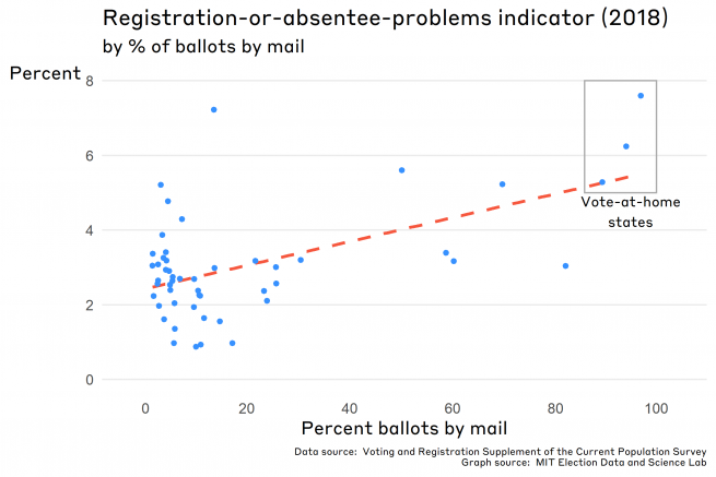
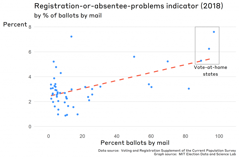
Although the registration-or-absentee-problem indicator is usually discussed in terms of voter registration difficulties, the survey prompt actually encourages respondents to conflate mail-ballot problems with registration problems. Because of that, it’s probably unsurprising that states in which more voters return their ballots by mail have higher values of the indicator.
This point is illustrated by the figure below, which graphs the value of the indicator in 2018 against the percentage of ballots returned by mail. (The latter statistic is, conveniently, also derived from the VRS.) At the far right of the graph are the three “vote-at-home states” (CO, OR, and WA) that mailed ballots to all voters in 2018. Considered together, they had the highest scores on the indicator (with higher scores representing worse outcomes). Although there is a lot of variability in this relationship, the general pattern holds.
This relationship between the level of use of mail ballots in a state and average values of the registration-or-absentee-ballot-problems indicator raises an important methodological issue to consider as the 2018 EPI is finalized. To illustrate this problem, we’ll pretend to examine two states that are identical in all regards except one: State A makes it difficult to vote by mail while State B is a vote-at-home state.
Only a small fraction of State A’s non-voters—perhaps as low as 5% — could even conceivably give this excuse for non-voting. Yet, all of State B’s non-voters could give this excuse. We would expect for this excuse to be given more often in State B simply because more voters are “at risk” of having a mail-ballot problem when the state relies on the mails to deliver ballots to all voters.
Moving ahead, one of the tasks for MEDSL will be to consider ways to “purge” this problem from the indicator.
Looking ahead
The registration-or-absentee-problems indicator is a survey-based indicator of the ease of registering to vote. Because values of the indicator are determined by hard-to-change policy choices, indicator values have not changed much — either in aggregate or for individual states — over the past decade.
The intention of the indicator is to focus on voter registration, but the question’s wording complicates things because it also mentions voting by mail. The long-term solution to this complication is for the Census Bureau to change the question, moving registration problems into a separate response category altogether. This solution, though, is rather out of the hands of those of us who work on the EPI project.
A short-term solution that is within our reach may be to statistically control for the contribution of absentee voting to responses to the question. Stay tuned for future posts where we do precisely this!
A more detailed look at the indicator
For those interested in a more in-depth report on the registration-or-absentee-problems indicator, read on for details about the indicator’s construction that we sidestepped above.
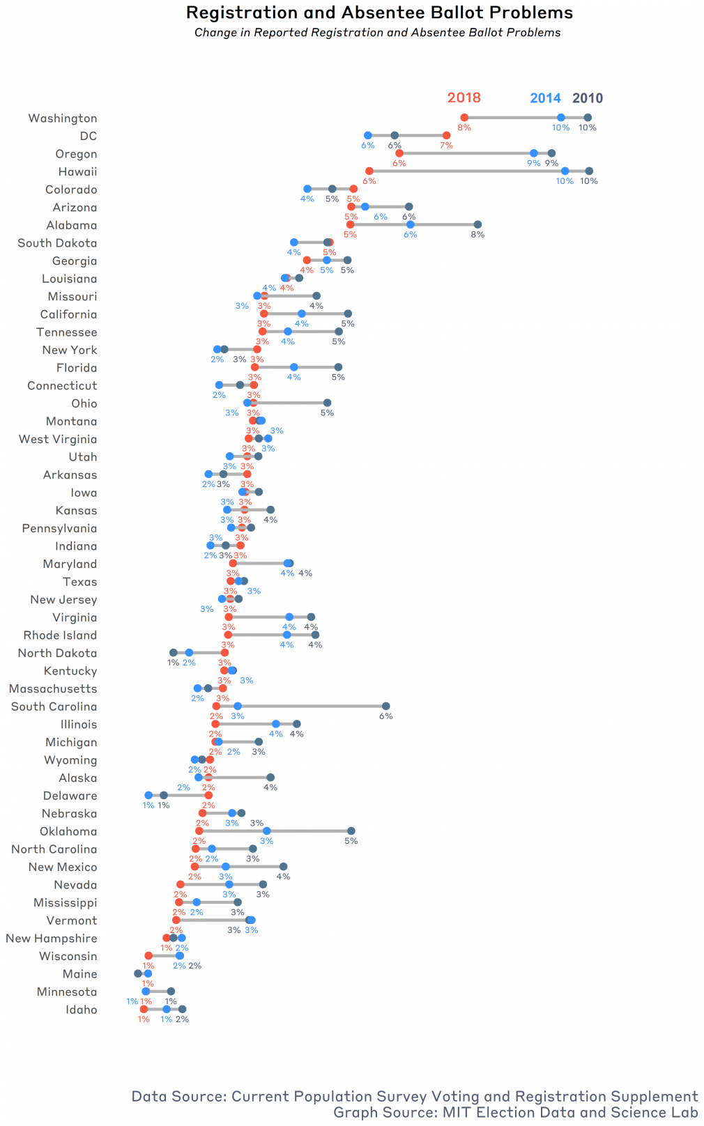
The following graph shows the value of the indicator as it was calculated using the new 2018 VRS data for each state, comparing it to the past two midterm elections. Note that for most states, the range of values is for these three elections is relatively narrow.
Getting into the weeds a bit, there is an important detail of this indicator that we should underscore. As the EPI methodology document discusses, the indicator value for a particular election year is the average of the value for that state over the past three similar elections (i.e., either midterm or presidential election.)
For instance, in reporting values of the indicator for Alabama in 2010, the indicator was calculated by taking values of the survey response for the three most recent midterm elections — 2002, 2006, and 2010 — and averaging those three values. In 2014, the indicator was updated by dropping the value for 2002 and adding the value for 2014, again taking the average of the three values to create the indicator.
The reason the EPI uses this three-election average is that for many states, the number of respondents to the question “why didn’t you vote?” is small enough that large election-to-election fluctuations can happen due to sampling variability alone. This is particularly true for the smallest states, which have the smallest number of respondents in a particular year.
Take the case of Alabama again. In 2010, only 316 non-voters were in the VRS sample from the state; of these, only 8 gave the “registration problem” excuse for not voting. Statistical theory would tell us that 95% of the time, we would get values of between 4.3% and 0.8% due to random variability alone. This degree of variability is too great if we want to pin down the fraction of non-voters in a state who actually had registration or absentee ballot problems.
While the original advisory committee that constructed the EPI was uncomfortable with this degree of variability, it was comfortable with using a common strategy in the social sciences when this sort of problem occurs—combine data from a number of years. If we triple the number of observations we use to construct the indicator measure (by taking three years together rather than one), the amount of variability declined by a factor of 1.7. Thus, we get greater precision, and a more accurate index.
The cost of doing this is that the indicator for 2018 (for instance) is not really an estimate of the extent of registration problems in 2018, but is actually an estimate of the extent of problems across the 2010, 2014, and 2018 elections. Because of that, the indicator will move artificially slowly if there is a “real” shift in the value in a particular year.

